|
A savvy consumer or sponsor of research must avoid being taken in by common tricks and fallacies. You’ve heard of unsound practices such as cherry-picking and fishing expeditions. Maybe you’ve heard of the Texas Sharpshooter Fallacy. Can you put your finger on why these are problematic?  In cherry-picking, results are chosen and presented that best fit the idea being promoted, at the exclusion of the other findings. In other words, what you're shown is a biased selection.  A fishing expedition is related. In this questionable practice, researchers continue to seek out findings (whether group differences, relationships, or what have you) until they come upon some that support their desired position. They analyze for as long as it takes to find the “right” results. Then they report those, downplaying or excluding all the others obtained along the way. (Another related term: “torturing the data until they confess.”)  The Texas Sharpshooter Fallacy is related as well. Imagine a person who sprays the side of a barn with a shotgun. Then he walks up to the barn and locates a spot where a few hits have formed a tight cluster. He paints a target around these; paints over all the rest; and proudly proclaims that "the target" is where he was aiming all along.
Underlying all three types of errors is the principle that the more analyses one conducts on a given topic, the greater the chance of a false positive. In a false positive, one is fooled into thinking a result is noteworthy when in fact it is caused by nothing more than chance. In addition, all three can be seen as examples of the unsound practice of Hypothesizing After Results are Known, or HARKing. HARKing is opportunistic; it inadvisedly focuses on what often turn out to be chance findings. You will find these types of errors discussed in the context of the Multiple Comparison Problem and, more subtly, The Garden of Forking Paths as described by leading statistician Andrew Gelman in his blog. Recognizing these errors when others fall for them will make you a savvier interpreter of research. Avoiding these types of mistakes will go a long way toward making your own work more sound. Contact: [email protected]
8 Comments
Statistical evidence on this topic has become pivotal to increasingly many criminal cases. In the tradition of Daubert v. Merrell Dow Pharmaceuticals, Inc., 509 U.S. 579 (1993), defense attorneys, prosecutors, and judges increasingly seek to evaluate the soundness, validity, or credibility of findings created by statistician-experts. This 9-page .pdf piece offers evaluation guidelines tailored to such cases and discusses pitfalls to avoid.
Presenting at the Best Practice Solutions higher-education Enrollment Management Symposium in Philadelphia (July 22, 2022) spurred me to solve a peculiar problem. The way financial aid related to attrition at a certain selective NY college had been stymying me. The solution took actual thought. You might find it instructive or entertaining. Techniques included
It's about a 10-minute read. Enjoy!
 This account draws from George Pipis’s “predictive ‘hacks’” page and Wikipedia. Introduction The St. Petersburg Paradox results from an imaginary lottery game. The game pays out winnings that, in the truly long run, are infinite. Despite this, when people are asked how much they would pay to play, they typically name a small amount such as $20 or $30. How the Game Works An ordinary coin is flipped until it comes up heads. When it does, the player wins some amount. If heads occurs on the first flip, the payout is $2. If on the 2nd flip, $4. If on the 3rd, $8. Etc. You can imagine that it’s possible, though not likely, for the first heads to “wait” until the 14th flip. In that case, winnings would be 2^14 or $16,384. How much would you pay for the chance to play? The Paradox In theory, and in the long run, there is no limit to the amount one could win at this hypothetical game. Even so, few people say they would risk a large amount. Wikipedia has good information on why, bringing in work on behavioural economics from researchers such as the legendary pair, Amos Tversky and Daniel Kahneman. Code: Try It Out Yourself The text file below contains several versions of code you can use to simulate results from this game. Some apply to the R software, and one is designed for SPSS. Each portion of code contains comments explaining the purpose or function of different commands. Enjoy, and feel free to share your observations or your feedback about the exercise.
 This short case study draws on an ingenious article by a Swiss-born physician. His classic article presents excellent material for deriving some lessons about data analysis, for novice and intermediate researchers. See the .pdf below.
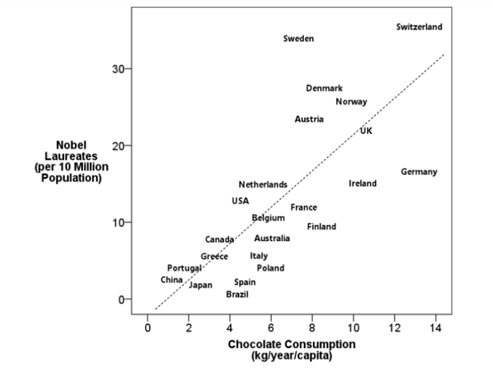
 Here is the principle behind tests of statistical significance.
There are two dice. One is given to you, one to me. We each roll just a handful of times and check our own average: somewhere from 1 to 6. With such a small number of rolls, your average and my average could be quite far apart. Maybe 3 vs. 5. Maybe 2 vs. 4.5. Even so, we’d probably trust that the dice were both the same. Now, suppose we each rolled thousands of times. Randomness, chance, works according to certain known rules. In thousands of rolls, differences ought to get smoothed out. Your average and mine should be very, very close together. Maybe 3.51 vs. 3.48. If they are not very close, most anyone observing would conclude: “Something else besides chance must have been inserted into the process. The dice must not be the same; this isn’t the sort of difference chance alone would produce.” Thus they would call the difference “statistically significant.”  The short presentation below explains the crucial difference between statistical and practical significance. It lets you test your ability to recognize each in the context of mean differences (T-tests) and relationships (correlations).
 Does it drive you crazy to see two analyses of the same data reaching opposite conclusions? I just discovered Simpson's Paradox, Lord's Paradox, and Suppression Effects are the same phenomenon – the reversal paradox, by Yu-Kang Tu, David Gunnell, and Mark S. Gilthorpe (Emerging Themes in Epidemiology 5.1, 2008).
Such contradictory results are all too common. It might seem at first that more of X causes an increase in Y, but when we control (or adjust) for Z, we find the opposite! I’m continually interested in ways to better use analysis to understand cause and effect, and to distinguish causation from mere correlation. So it’s important to get a handle on when and why such contradictions can occur, and what’s the best way to interpret them. The authors methodically explain what conditions can lead to such reversals. They show how each of three types of reversal effects can occur when statistical control is introduced, and they explain how variables’ level of measurement (categorical or continuous) affects the type of reversal that can occur. Most important, Tu et al. stress that when we decide whether to control for some confounder, or nuisance variable lurking in the background, we shouldn’t make this decision purely on statistical grounds. It takes sound knowledge of the subject matter in question, and not merely statistical know-how, to design an analysis that will produce solid and believable cause-and-effect results. “It's easy to lie with statistics; it's easier to lie without them.” Frederick Mosteller 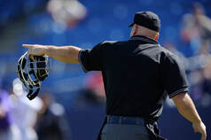 An ingenious FiveThirtyEight article by Michael Lopez, Brian Mills, and Gus Wezerek tries to show that "Everyone Wants To Go Home During Extra Innings — Maybe Even The Umps." They find that in extra innings major league umpires, probably unwittingly, change their patterns of ball and strike calls in ways that tend to end the game quickly.
The authors analyzed a sample of roughly 32,000 pitches thrown between 2008 and 2016. They obtained data using Bill Petti’s baseballr package, scraping pitch locations from Baseballsavant.mlb.com. I love the fact that they undertook this work, and their nifty data graphic, but I wish it were clearer what question each result answers. At one point the main question is presented as a) How much umpires tend to favor calls that would hasten an ending, comparing certain extra-inning scenarios vs. ordinary scenarios. At another point it's stated as b) Strike rates in certain extra-inning scenarios for "teams that are in a position to win vs. teams that look like they’re about to lose." A third and more complex comparison is implied by c), How umps "changed their behavior in these situations between 2008 and 2016," but I doubt this is what the authors intended to say. Comments to the article abound, but until we know for sure what each finding means....Finally, not that statistical significance is the be-all and end-all, but it wouldn't have hurt to run a significance test or two, to let us know just how unusual the differences cited would be if one supposes they occurred by chance.  I've looked in vain for a good, in-depth treatment of the Harvard case centering on anti-Asian bias. The Oct. 11 New Yorker column by Harvard Law professor Jeannie Suk Gersen introduces the problem but declines to cite a single number. Elsewhere, reporting commonly cites Asian-Americans' outsized percentage of the Harvard student body vs. their percentage of the US population. What I don't see is any source definitively reporting this group's admission rate as compared with other races'--let alone pinpointing that difference when one controls for other relevant factors. That's the crux of the matter.
The Oct. 12 Nell Gluckman article in the Chronicle of Higher Education suffers from this deficiency. So does Colleen Walsh's Aug 31 Harvard Gazette story. Somewhat more helpful is this passage from Julie J. Park's Sep. 24 Inside Higher Ed column: "According to an expert report filed in the case on the side of Harvard by David Card of the University of California, Berkeley, the admit rate for the Classes of 2014-2019 was 5.15 percent for Asian Americans and 4.91 percent for white applicants who are not recruited athletes, legacies, on a special dean’s list or children of faculty/staff members. It is problematic that white people are more likely to fall into these special categories [....]" This leaves me to imagine that an apples-to-apples comparison, one which adds back all such special categories for Whites, could yield racial admit-rates that are sharply different, on the order of 12% vs. 5%, or rather similar, such as 7% vs 5%. More helpful still is the Economist story from June 23. It describes an intriguing result from the plaintiff's consulting economist, Peter Arcidiacono, using an unspecified "statistical model." Controlling for other (unspecified) factors, "He estimates that a male, non-poor Asian-American applicant with the qualifications to have a 25% chance of admission to Harvard would have a 36% chance if he were white. If he were Hispanic, that would be 77%; if black, it would rise to 95%." This summary, of course, describes a special, narrow case. The full analysis would presumably cover students from the entire socio-economic spectrum, from all genders, and so on, and those findings could hardly be as striking as these. We can only hope Arcidiacono's methods are given adequate scrutiny. Models purported to be establishing cause and effect, especially those that rely on statistical control, can go awry in so many ways. And they can lead to bizarre conclusions. The late statistician Elazar Pedhazur used to spoof analyses that in effect answered questions akin to "How tall would this corn plant have grown if it had been a tomato plant?"  It's heartening to see the original, high-quality research reflected in Might School Performance Grow on Trees? Examining the Link Between “Greenness” and Academic Achievement in Urban, High-Poverty Schools, a joint project of the U. of Illinois and the U.S. Forest Service. Ming Kuo, Matthew H. E. M. Browning, Sonya Sachdeva, Kangjae Lee and Lynne Westphal have admirably investigated the connection between amount of tree cover around Chicago schools and the extent of student learning in math and reading, while striving to rule out other factors that could explain the variation in student performance.
How unusual among educational research projects to gather data using "Light Detection and Ranging (LiDAR) collected with a scanning laser instrument mounted onto a low-flying airplane"! One might be impatient to suggest, as I was, that amount of tree cover at school could be serving as a proxy for level of affluence in the neighborhood generally-- which would perhaps be a truer cause of achievement level. The authors thought of this too and controlled for it effectively in their sequential regression analysis: "School Trees contribute uniquely to the prediction of academic achievement even after Neighborhood Trees are statistically controlled for. Neighborhood Trees, however, showed [little relationship with achievement] once School Trees were statistically controlled for. These findings suggest School Trees are stronger drivers of academic performance than other types of greenness, including grass cover and trees in surrounding neighborhoods." I also recommend this article for its intelligent Limitations section.  "Ours is the first study to evaluate the effectiveness of sugary drink warning labels," touts Grant Donnelly, a lead author of a joint study by the Harvard Business School and Harvard University Behavioral Insights Group. Kudos for their smart approach to testing the effect of images as part of those warning labels (objective measures showed that images indeed brought about the desired reduction in purchases).
But shame on the researchers for ignoring or missing decades of psychological and behavioral-economics research on the best ways of investigating cause and effect. For the study also incorporated a naive direct question asking participants "how seeing a graphic warning label would influence their drink purchases." An abundant literature, from Nisbett and Wilson (1977) to my own recent article, shows that it would be foolish to trust in such subjective interpretations of the factors behind each person's decision-making process. After acquiring such good, objective information, why would Donnelly et al. water it down with subjective findings that are sure to introduce bias? UPDATE: the original study materials made available by the authors at Open Science Framework tell a different story than the summary in the Harvard Gazette quoted above. The survey did not ask respondents "how seeing a graphic warning label would influence their drink purchases." Instead, the survey asked for reactions to the images and then separately asked about intention to buy a soft drink. Evaluated in this way, each topic was much more amenable to unbiased reporting by a participant than that person's causal assessment would be. The responses would then be linked "in the back end" by the researchers to investigate any causal connection. A good design after all.  The most impressive users of research and analysis are those who take the results and feed them into further experimentation. The instinct to test, to experiment, creates progress regardless of whether the industry is business or academia, for-profit or non-profit.
Once, after a lengthy discussion of admissions and financial aid policy options with a college administrator, one of us suggested what was for that school a novel course: experiment. Take the alternatives that were the subject of so much protracted consideration and put each into practice with a subset of prospective students. In two months, evaluate each action. "This is the real world," the administrator responded. "We can't play games!" Think about how you would respond to this. Is empirical testing somehow risky? If so, is it riskier than setting a course without the benefit of evidence? You can compare it to the choice to keep money under the mattress. The person making that choice has to be unaware that investment risk is overshadowed by the near-certainty of inflation eating into the value of that cash. Kudos to those who find ways to use analytic results to enhance further learning and to push toward the next peak. If that describes you, we'd be proud to help. 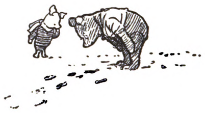 I just discovered Eric D. Nordmoe's fun and informative creation from 2004. "A walk through Milne's Enchanted forest leads to an unexpected encounter with hypothesis testing." This enjoyable little article is instructive for those new to statistics and full of pleasing connections for the initiated.
 Suppose a nationally-scaled, 30-year, multiple-author, peer-reviewed, non-partisan, public-health-oriented study concluded the following: "Where guns are more widely available, no more of the burglars and intruders are getting shot, but more of the gun-owners' family and friends are."
This is the central finding of The Relationship Between Gun Ownership and Stranger and Nonstranger Firearm Homicide Rates in the United States, 1981–2010. The authors explain, "Our models consistently failed to uncover a robust, statistically significant relationship between gun ownership and stranger firearm homicide rates (Tables 3 and 4). All models, however, showed a positive and significant association between gun ownership and nonstranger firearm homicide rates." They add: "for each 1 percentage point increase in the gun ownership proxy, [stranger firearm homicide rates stayed the same, whereas] nonstranger firearm homicide rates increased by 1.4%. [Similarly,] a 1 standard deviation increase in gun ownership [13.8%] was associated with a 21.1% increase in the nonstranger firearm homicide rate." The research is very sound.
Can you refute their findings?  [From a major outlet for health care research findings, Fierce Health Care. I've reproduced key passages in blue-black and commented inline in orange.]
Employment status is the top socioeconomic factor affecting 30-day [US hospital] readmissions for heart failure, heart attacks or pneumonia, according to a new study from Truven Health Analytics. [Such a conclusion is on very shaky ground, as you'll see.] As readmission penalties reach record highs, analyzing causes is more important than ever. [Granted!] Researchers, led by David Foster, Ph.D., collected 2011 and 2012 data from the Centers for Medicare & Medicaid Services and used a statistical test called the Variance Inflation Factor (VIF) for correlations among the nine factors in the Community Need Index (CNI): elderly poverty, single parent poverty, child poverty, uninsurance, minority, no high school, renting, unemployment and limited English. [In truth, the VIF tells not what is the most important factor, but only to what extent the different factors, or independent variables, overlap with one another, potentially confounding the results. In this case, trying to isolate one indicator of socioeconomic status (SES) while controlling for eight others will surely distort any connections found. These SES indicators are too much "part and parcel of" one another, too inseparable, to allow for valid use of control in this way. To explain further: it's a mistake to ask "How much does SES (indicator 1) relate to readmission if we statistically remove SES (indicators 2-9) from the relationship?" That'd be much like saying, "How addicted am I to desserts if you discount my intake of cookies, pie, and ice cream?" Or there's Monty Python's question, "Apart from the sanitation, the medicine, education, wine, public order, irrigation, roads, the fresh-water system, and public health, what have the Romans ever done for us?"] Their analysis found unemployment and lack of high school education were the only statistically significant factors in connection with readmissions, carrying a risk of 18.1 percent and 5.3 percent, respectively, according to the study. [As explained above, these are not valid conclusions to be drawn. But even if the numbers were somehow accurate, what could such statements mean? That readmission risk becomes on average 5.3% for non-high-school graduates? It can't be -- that'd be far too low. That it's 5.3 points higher than it would be otherwise? It can't be that either -- too high. How about 5.3% higher in relative terms? Maybe, but that's about 1 point, which would hardly merit calling high school education an important factor. So what's left?]  Want to know to what degree political demonstrations produced results in elections? Track the rain. The rain? It actually makes a beautiful example of what's termed an instrumental variable. Read Dan Kopf's excellent Quartz summary or the full article by Andreas Madestam, Daniel Shoag, Stan Veuger, and David Yanagizawa-Drott from Harvard and Stockholm Universities.
Whether it rains at protest locations can scarcely have anything directly to do with ultimate election results, but it unquestionably relates to turnout for each demonstration. If the size of turnout relates to election results, then the rain should, statistically (if not causally), relate to them as well. "If the absence of rain means bigger protests, and bigger protests actually make a difference, then local political outcomes ought to depend on whether or not it rained [on protest days]...As it turns out, protest size really does matter."  "Fifty-eight percent of national variation in hospital readmission rates was explained by the county in which the hospital was located," announce Jeph Herrin et al. in Community Factors and Hospital Readmission Rates, published in 2014 in Health Services Research. Sound odd to you? After all, for most readmission studies the percent explained is in single digits. Being able to account for 4 or 5% of the variation translates to an ability to assess individual risk that can meaningfully aid in clinical decisions. Even Harlan Krumholz and his team of 17 researchers and statisticians, the ones whose predictive models underpin the national readmission penalty system, have usually explained only 3-8%. And those models have taken into account about 50 input variables.
It turns out that Herrin et al. took their data on 4,073 hospitals and broke it down by 2,254 counties. There were almost as many counties as hospitals themselves. And many counties contained only a single hospital. Now, suppose the authors had divided the 4,073 hospitals into, say, 4 groups defined by region, and found that the 4 groups had sizeable differences in readmission rate. That would have been a meaningful way to summarize the data. Even with somewhat more groups -- say, one for each of the 50 states -- that might have been meaningful, though the data would have been spread pretty thin for some states. But to "explain" differences using 2,254 groups? It's not a far cry from simply listing the readmission rates of all 4,073 hospitals and claiming victoriously to have "explained" 100% of the variance in the hospital-to-hospital rate. Sounds like a feat for Captain Obvious. It's tautology. With such an approach, any apparent "explanation" of the outcome is empty. One reason why this matters a great deal is that, to the extent that some geographic factor is considered responsible for this outcome, hospital performance will no longer be. So if county legitimately explained 58% of the variance, then hospital performance, it might be argued, couldn't account for more than 42%. This is the incorrect conclusion that was reported in unqualified fashion by news outlets such as Becker's Hospital Review. The article by Herrin and colleagues makes contributions in other ways, of course, but the chief findings are very misleading. Watch for dialogue, in Health Services Research or elsewhere, on how to interpret the results. The upshot should be quite a bit more nuanced and moderated than what we've seen above. And if you're interested in the role of socioeconomic factors in hospital readmission, you'll find some eye-opening results out of Missouri at Science News. |
AuthorRoland B. Stark Archives
September 2023
|
||||||||||
 RSS Feed